It is with great honor and reverence that the majestic Ivory Tower has bestowed these images to me. As the exclusive beat reporter for all things MNL, it is my duty to reveal what the league will be wearing for the upcoming season. New for this season, all jerseys in the league will wear a commemorative patch glorifying the partnership with Labatt on their right chest. ‘On behalf of the entire Labatt Parks and Rec Division, we want to thank MNL for their allegiance to our brand and lifestyle” said David Pope, Chief Operating Officer.
The The following descriptions come with the disclaimer… ‘The views and opinions expressed in this article are those of Dickie Dunn and do not necessarily reflect the views or positions of Panty Dropper, Troy Otto, Paul Antioch or Whoop.’ The uniform analysis is in no particular order…
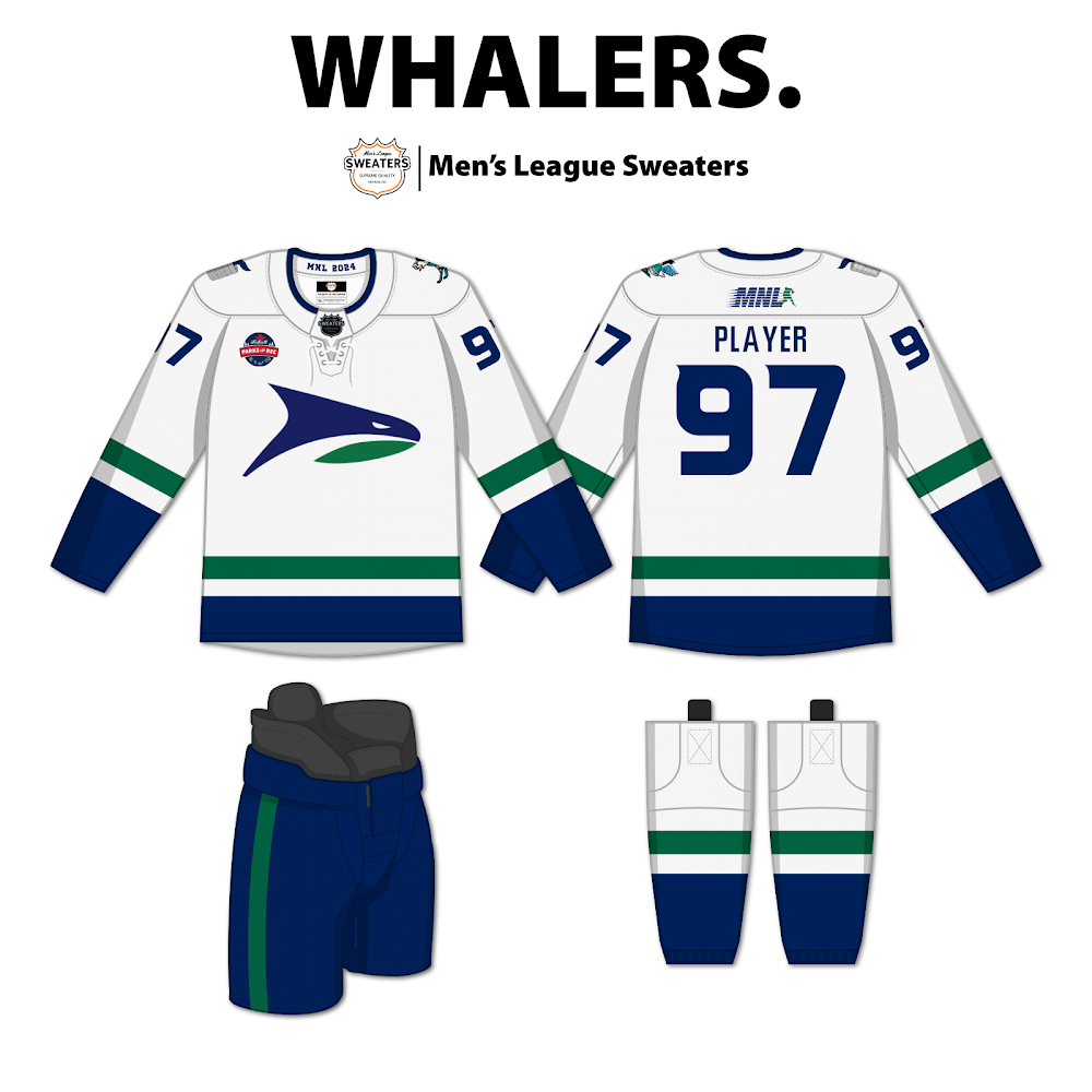
By far the best looking logo in the league. Its a elegant modern approach to the Canucks killer whale. The logo itself portrays a sense of utter domination and the business end of the whale faces south as an ode to Goose’s downriver roots. One of only two teams to elect to have shoulder patches. The right shoulder patch pays reverence to the organizations Stanley Keg prowess but I’m not too sure what’s going on with the other side. This is a classic uniform behest of classic franchise. Dickie Dunn Best Dressed Award grade: B+
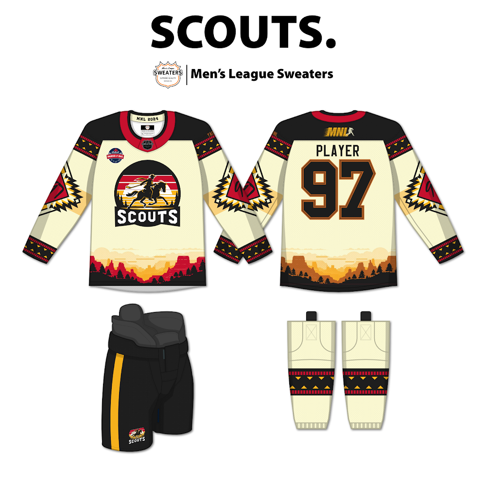
WOW! The Scouts pull off the best upgrade from one year to the next with this southwest spin. Staying true to the original color scheme, Cipps threw in a big twist. “I was having a very vivid and fanciful dream where I was a lone pale rider gallivanting across the open expanse near the Rio Grande in search of the meaning of beer league hockey….” ok Cipps that’s enough! The cream base of the sweater plays great with the burgundy and yellows. I love how the numbers on the sleeve are adorned in burgundy but would have selected a different font. This kit would look great with everyone in black pants, gloves and helmets. Love the logo but it is my opinion that this wild uniform was inspired to hide an wildly awful organization. Dickie Dunn Best Dressed Award grade: B-
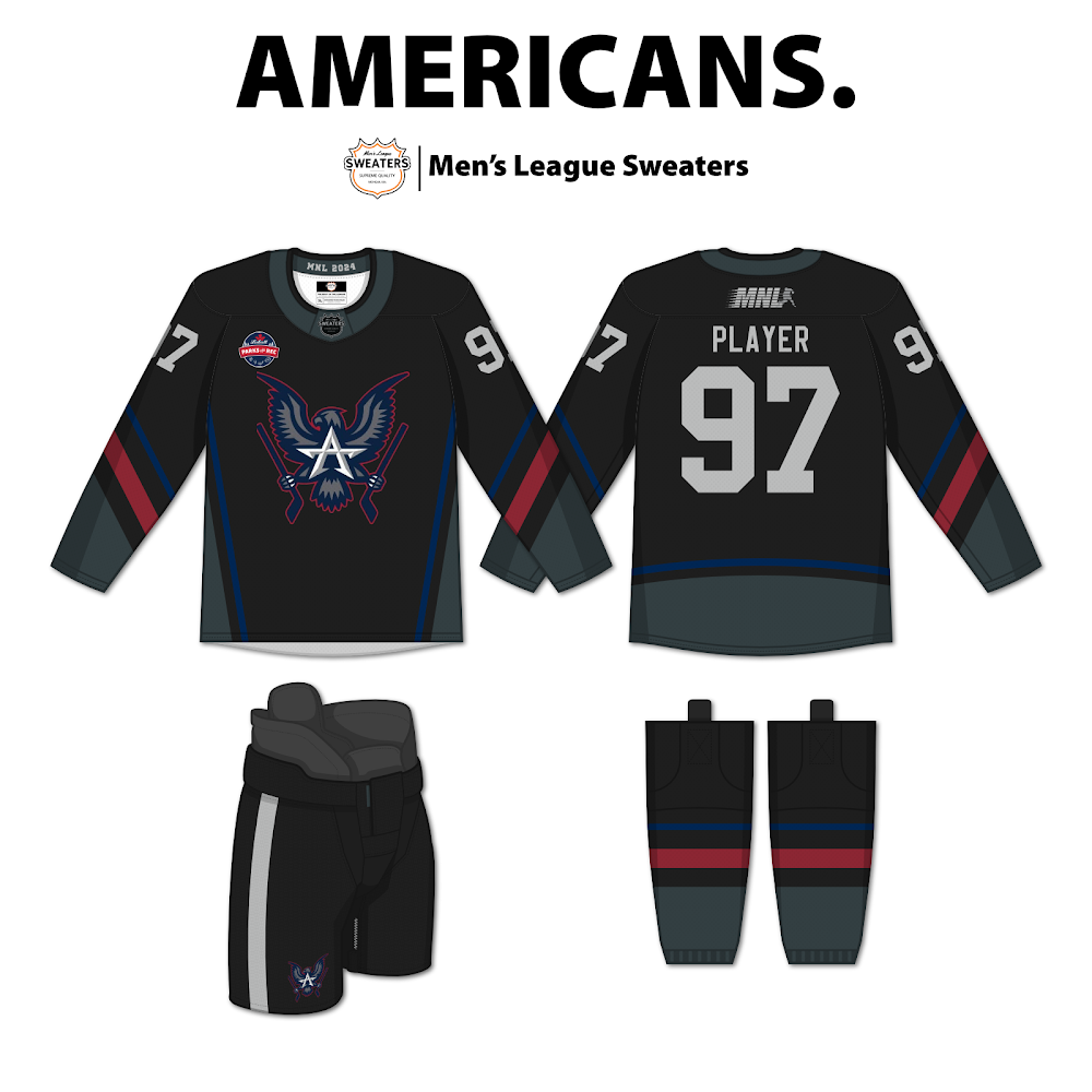
The Americans inspired uniform comes from a very dark place. We better hope the lights never go out inside Viking Arena. It was dark and troubled times for the Amerks last year and this sweater does not point them in the direction of a bright future. The crest is fantastic but it is muted by the dark background. The Labatt patch looks like it was made for this ensemble. I think the club could have saved money and just wore their black MNL practice jerseys. The more I look at this the more I think the team should be playing broomball. This is what happens to the when Turtle is no longer in the league. The NHL Islanders called and want their crappy jerseys back.
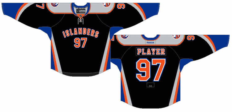
Dickie Dunn Best Dressed Award grade: D

Love this version of the Tigers. Skilly and Eidt are not afraid to make bold uniform choices. These men are not shy to change up the color scheme and have no loyalty to brand. This is a vast improvement on the LSU version. More of a classic hockey look as opposed to the gawdy tiger stripes of yester-year. The Tigers are the only team to go numbers across the chest much like a college team. The script is nostalgic but wistful. I may have elected some type of tiger inspired logo instead but the overall look is crisp and beautiful. They do stay a little to their roots with the eye of the tiger on the shoulders. My only hope is that the color depicted in this mock up is the same color red on the ice. It pops! This uniform fucks! Dickie Dunn Best Dressed Award grade: A-
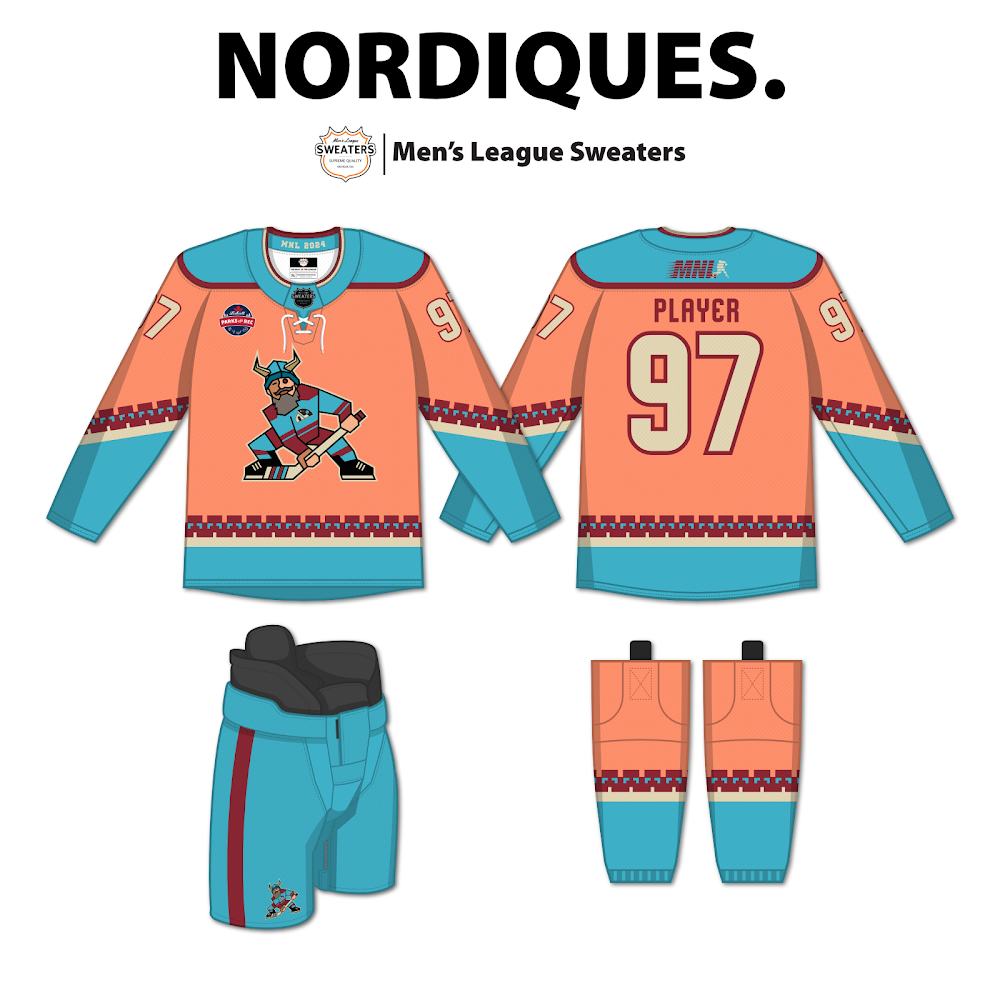
Bow your heads everyone… the Disco Diques are dead. Once revered as the absolute best looking uniforms of all time, the Nordiques have shit the bed.
We might as well give the 2025 Dickie Award for the Hal Doherty September Heisman because this is terrible. It looks like a flamingo was in a head on car crash against a coyote. I can guarantee that no one will have any gear to match this set. Not even 2024 All Dressed Team winner DougE could save this mess. Could you imagine if this team drafts Pelot and he breaks out those old school Washington Capitals breezers? GM’s have to take into account what normal beer leaguer’s have in terms of essential equipment. Most everyone has black mitts, bucky and pants. With that being said Antioch and Panty drop this abortion into the mix? The result will be vomit inducing. The only redeeming quality to this utter disaster is the tiny crest woven upon the viking horned adorned norseman. Dickie Dunn Best Dressed Award grade: F
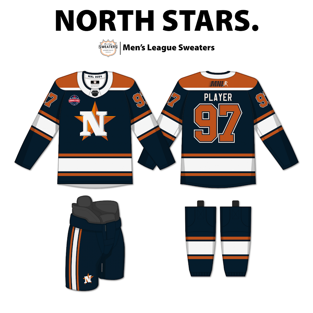
For the first time in North Stars history, they have strayed away from their core colors. I believe there is a hidden and subliminal message being delivered to the rest of MNL from the evil mastermind Troy Otto. The kit is an obvious homage to the despicable and unscrupulous Houston Astros who illegally used a camera system to steal signs during the 2017 regular season and postseason in order to win it all. It is not a far leap to understand that the morally bankrupt combination of Troy and Pearcy will cheat to win a Keg. The Astro inspired look will be a visual reminder to all who take the ice against them that sinister play is afoot and encouraged as a North Star. Remember to pack your white and black MNL practice jerseys every week because with all these dark colors you will need them. Dickie Dunn Best Dressed Award grade: C
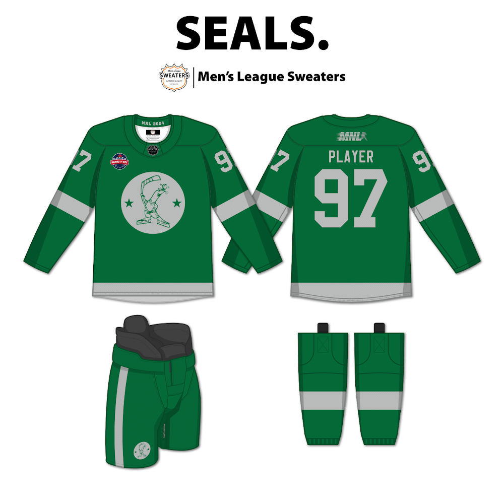
I love when teams wear green but this could have been done much better. Very simplistic. Good color combination. Just meh overall… But I did notice a very unique and cool detail within the crest. There are two stars flanking the seal. European soccer teams often include stars in their crests to represent important achievements in the team’s history. These unmistakingly represent the two Kegs in franchise history, 2017 and 2021 respectively. The seal itself is too cartoonish. I would prefer a viscous seal eating a mollusc or a picture of Goose dining on some chicks ass. The Seals would benefit the whole look if they opted in on pant shells for the entire squad. Dickie Dunn Best Dressed Award grade: B-
Whatever team you end up on this upcoming year will be a privilege and we should feel lucky to be involved in the #1 beer league in the world! Don’t forget the 2024/25 Draft and the annual Dickie Awards happens Saturday July 13th at 4pm at the Royal Oak Elks presented by Sugar Shawn Hardy!
