The Ivory Tower, in conjunction with the MNL Players Association, released a preview of all of it’s teams jerseys on Thursday for the upcoming 2021/22 season. A cornucopia of colors will grace the ice during league play this year. So long are the days of five of the seven teams wearing grey. Some teams challenged their fan bases with bold new primary colors and some chose a more original flavor. Here are Dickie’s rankings on which teams won the uniform championship and ones that deserve to go right to the bargain bin at Big Lots…
7. Tigers: Boring design and basic color choices. Definitely had a huge selection of ferocious tiger logos to chose from and elected to go with the “New York Ranger” look with diagonal font instead. The orange/yellow trim will be hard for players to match up gloves. The Tiger on the shoulder looks more like a drunk muskrat. The only saving grace is most skaters already have black helmets, gloves and pants. The potential to come up with some sweet uniforms was there… but Skillman/RAllen lacked creativity.
Grade: D-
6. North Stars: A bold change for Stars GM’s this year. Not normally known for their “esprit de corps”, the North Stars chose electric yellow (hi-lighter yellow) for their primary color. “I mean the Otto’s are practically royalty… so we tried to bring back the charm of the old LA Kings logo by reprising it with the Kings of the North look” said GM Tye Otto. The club would look great if the entire squad donned the green pants to bring the whole ensemble together. Pelot needs to drop those red white and blue breezers before someone has a seizure watching him skate out there.
Grade: C
5. Seals: Not bad at all. These sweaters look crisp and I absolutely love the choice of green numbers and blue piping. The logo looks great but I have some concern on the black head of the seal itself. It makes a little sense if the collar is black also. If the numbers are actually two-toned this sweater comes together nicely. I think these are going to look fantastic in motion.
Grade: C+
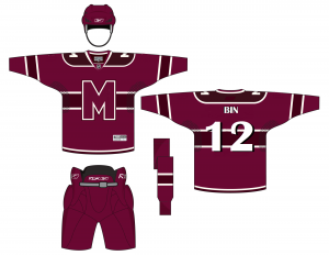
4. Maroons: Endorsed by Gordon Bombay himself. Cleaver Canadien DougE and mouthpiece Brian Pearcy chose to push the envelope with this design and color scheme. Using their traditional burgandy, the Maroons adopted the “teal-ish” main color for the body. The griffin patch and french quote of “I Remember” on the shoulders is a play on how good the Maroons were last September. People are going to either love or hate this choice. There will be no in-between on this topic. Opposite of how I feel about the Seals… this may be an atrocious looking in motion. But as of now, this is a creative color palette that could probably make the Maroons Tik Tok famous.
Grade: B-
3. Whalers: Very traditional and very dignified. Hearken back to the days of the Plymouth Whalers and Justin Williams and Stephen Weiss. An absolutely beauty of a logo. The classic green and navy is spectacular. The whalers return with an alluring shade of green as their primary color complimented by light grey. Definition of a classic sweater. Heck, even the NHL Hurricanes know a good thing when they see it. This years kit solidifies why the Whaler organization is the MNL standard. Although with Loosey Goosey in a top management position this is subject to change.
Grade: A-
2. Americans: By far the Americans have the sickest logo in the league. Both the primary chest logo with the screaming primogenitor and the shoulder patch of the top hat adorned A are instant classics! Antioch and Crunk absolutely nailed this jersey. I love the four navy piping stripes on the arms and across the waist signifying the amount of years Paulie has been in power. Players could pull off either blue or red pants and gloves and both would be striking. As the only team in the league wearing grey this year, the Americans will stand out from the pack. Hopefully Rebirth makes a child small for Vape.
Grade: A
1. Nordiques: Wow, wow, wow! Hands down Dickie’s favorite. Unapologetically, Panty Dropper turns the Diques fanbase up side down and switches to all red kits for 2021/22. This is a beautiful but simple look with gorgeous synergistic colors and breathtaking accent striping adorned with the Fleur de Lis. Gio Orlandi would have looked splendid in these. Having being draped in red from head to toe commands and exudes power. Kudos on the elegant front logo which needs no introduction. There are many Nordique concepts out there if you search the Google-machine, but this rendition is straight fire. Compliments to Panty and Busta on making the difficult decision to break from the legendary baby blue. It paid off!
Grade: A+
This has been Dickie Dunn
