It’s finally here! After a grueling 2 week contest, the ballot has finally been counted and all the vote has been tallied. In a unanimous decision, each team has been placed in the Official power rankings.* With all that out of the way, let’s look at the power rankings!
*Note: Official is the brand name of these power rankings. The views expressed in this article do not necessarily reflect the views of the league, teams, or common sense in general.
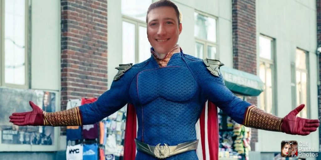
1. Whalers
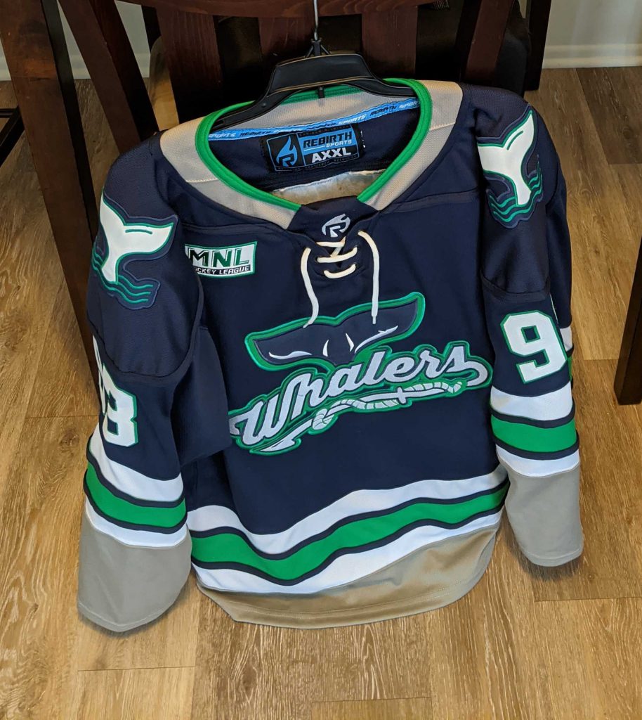
This sweater is a beaut. The Whalers know how to draft and they know how to design a good jersey. Most teams could learn a thing or two from their color matching, stripe width, and professional looking patches.
2. Seals
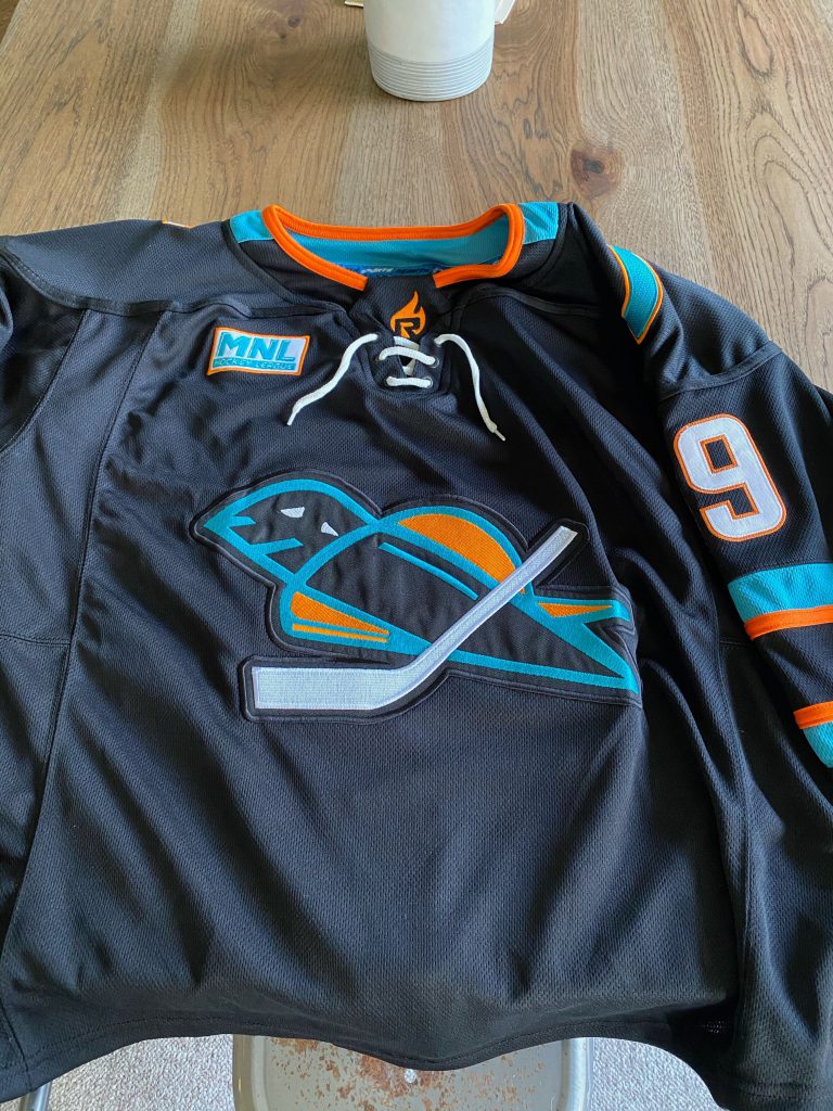
The Seals know that a little can go a long way to making a great jersey. The logo is a fresh take on an old classic. Clearly ShaunE was the mastermind behind this, because it’s clear from the Stars jersey that taste doesn’t run in the Otto’s family.
3. Nordiques
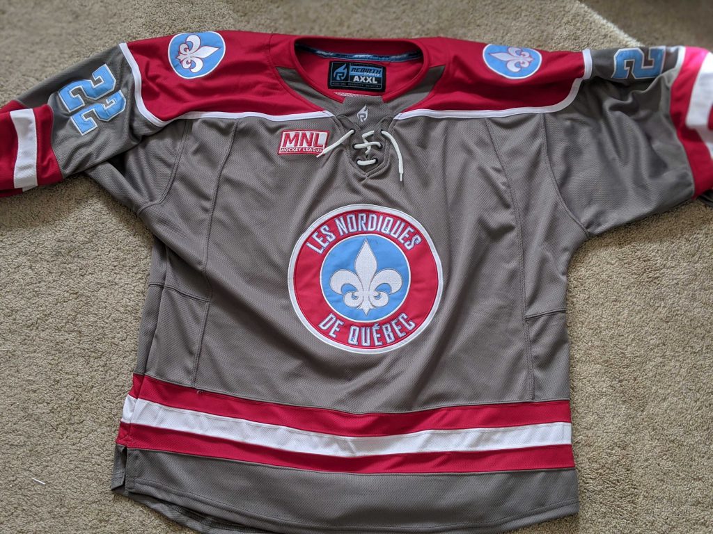
Overall a solid jersey. The grey is dark enough to not interfere with most colors except for maybe slightly different grey (cough, tigers, cough). The new logo is a fresh sight for this original team and the shoulder patches bring this set from medium to spicy.
4. Maroons
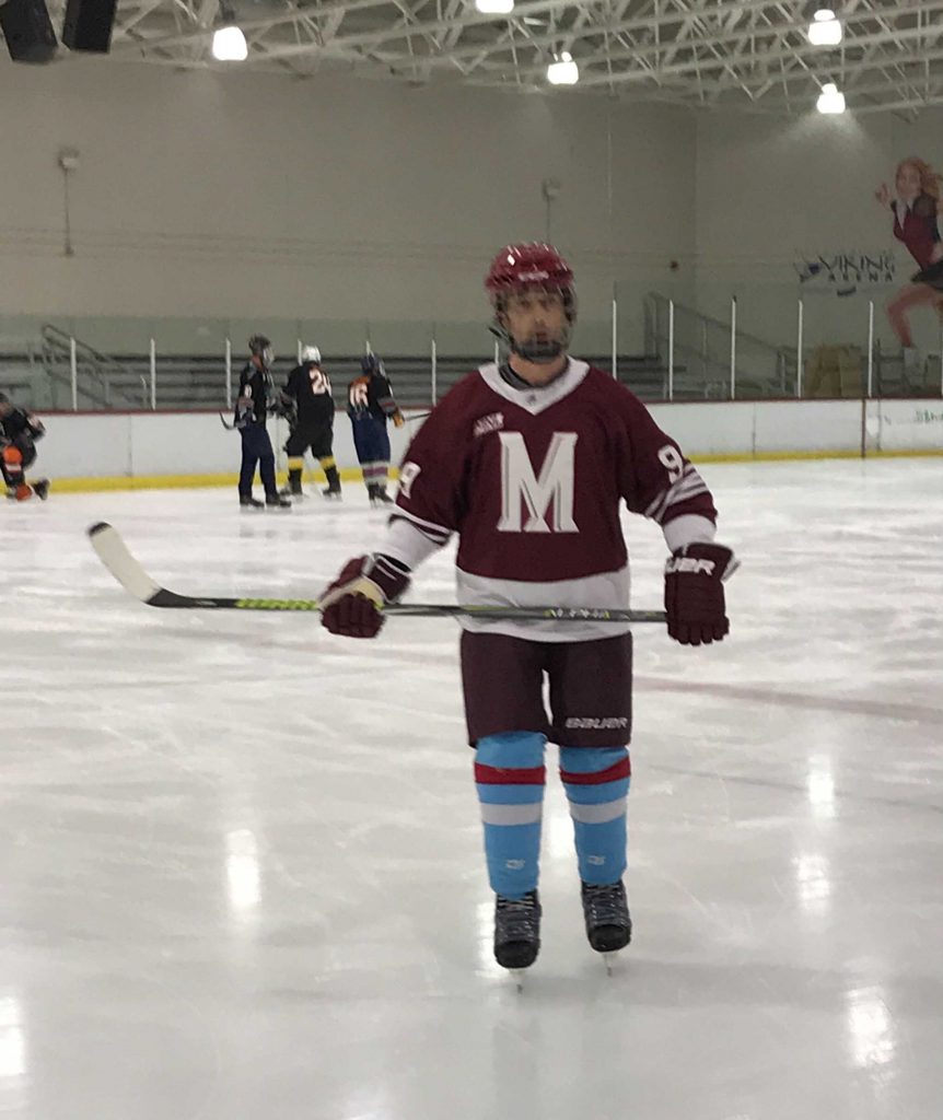
The Maroons are really only 4th because of how good the first 3 are. The Maroons did not really do anything particularly risky, but almost everything they did was solid. The only issue I have is the white cuffs and waist are a bit too wide for my taste. The Maroons are a great example of how to do a standard jersey well.
5. Americans
The Americans did their color swap for the season and then called it good. They don’t look bad (from memory), but they’re certainly not catching anyone’s eye. But don’t worry. It could be worse… a lot worse…
6. North Stars
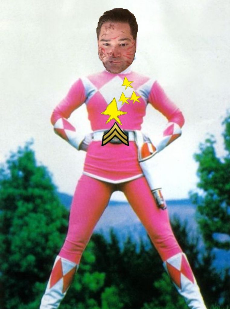
Usually when you let your kid design your logo in MS Paint, you have someone with talent touch it up before sending the final thing to production. What could have been a solid look with a lot of history (KOTN patches had potential to be cool) ended up looking like the bargain bin Power Rangers panhandling for nickels on the subway. I’m willing to give this one a pass if Troy admits in writing he agreed to let Tye design the jerseys in exchange for full executive control of the draft.
7. HERE COME THE TOGERS
Oh boy, what can I say about this that hasn’t already been said? Is it really fair to rag on the last place team by also tearing apart their last place design? I want Skillman to let me sub every once in a while, so I’m going to refrain from saying anything else.
Note: Any plagiarism seen above is either intentional or I don’t care.
From the desk of Carlos Antonio Machismo
